OKLCH: The Future of Color in Design Systems
Yo, let’s dive into something that might sound a bit techy but is actually super exciting for designers: OKLCH. Yeah, I know—what’s with the fancy name? But trust me, it’s worth understanding, especially with the latest updates from TailwindCSS. So, grab your favorite beverage, and let’s chat about why OKLCH might just be your new best friend in the design world!
What’s the Big Deal About OKLCH?
First off, let’s break it down. You’re probably familiar with RGB and HSL, right? RGB uses those hex codes (like #0077CC—yep, that’s a blue), and HSL is a bit friendlier (think hsl(205deg, 100%, 40%)). But here’s the kicker: both of these have some quirks that can be a pain for designers.
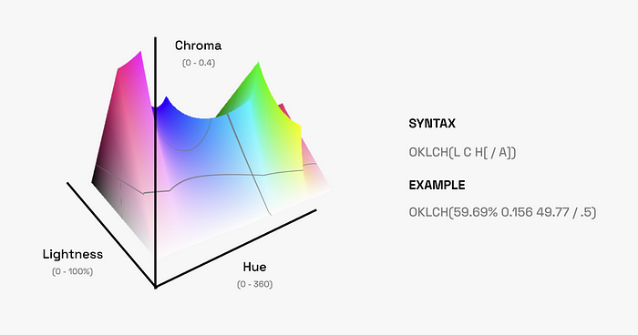
Enter OKLCH! 🎉 This new color space gives us a way to think about color that’s more in tune with how we actually see things. It stands for Oklab Lightness, Chroma, and Hue. Sounds cool, right? And it’s written like this: oklch(56.01% 0.1577 249.8 / 50%). Don’t let the syntax scare you off; we’ll get to that in a minute!
Why Should You Care?
OKLCH is all about making your life easier. You know those times when you’re trying to create a color scale for your design system? It can feel like a juggling act—especially when trying to keep things consistent across light and dark modes. With OKLCH, the transitions between colors feel way more natural. You can adjust lightness and chroma without messing with the hue, meaning you get a more predictable outcome. No more guessing games!
Let’s say you want a color to look just right. With OKLCH, you can tweak the brightness and saturation to match how our eyes perceive them. This is a game changer, especially for accessibility. You want your designs to be usable for everyone, right? OKLCH helps with that!
More Colors, More Fun!
Did you know that OKLCH supports a broader range of colors thanks to P3 compatibility? 🚀 That’s about 30% more colors to play with compared to good ol’ RGB! Imagine the possibilities for your palettes. More vibrant, more dynamic, and definitely more fun!
Putting OKLCH to Work
So, how do you start using OKLCH in your design system? It’s simple! Instead of getting caught up in tweaking individual colors, you can create a consistent color scale with ease. For example, when you want to create a hover state, you can use a CSS function like:
So, Why Are We Still Using RGB?
Okay, let’s get real for a second. Even though OKLCH is super cool, it’s not everywhere just yet. Many native app frameworks haven’t fully caught up, and most desktop monitors still stick to the sRGB color space. Plus, popular design tools like Figma and Sketch are still lagging behind with OKLCH support. That means you might still need to convert things back to RGB for now.
But don’t let that stop you! You can absolutely start using OKLCH today. Just set RGB as a fallback, and you’re golden. This way, your designs will look great on all devices, old and new.
Final Thoughts
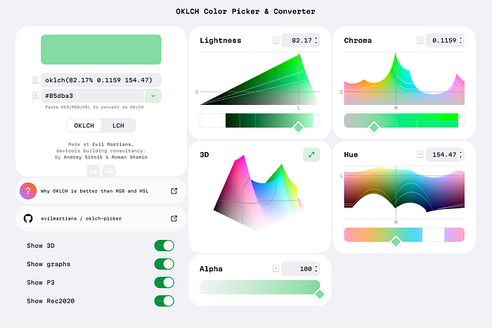
As designers, we’re always looking for ways to improve our craft. OKLCH is a step in that direction. It bridges the gap between design and development, helping us create better, more accessible designs. So why not give it a try? Experiment with it in Chrome DevTools or check out some handy color pickers online.
I’m excited about the potential of OKLCH, and I hope you are too! Let’s embrace this new color standard together. Have you tried it out yet? I’d love to hear your thoughts! Happy designing! 🎨✨
Join Telegram Channel
Stay updated with the latest news and insights. Join Telegram channel @adbro_news.
Join Now